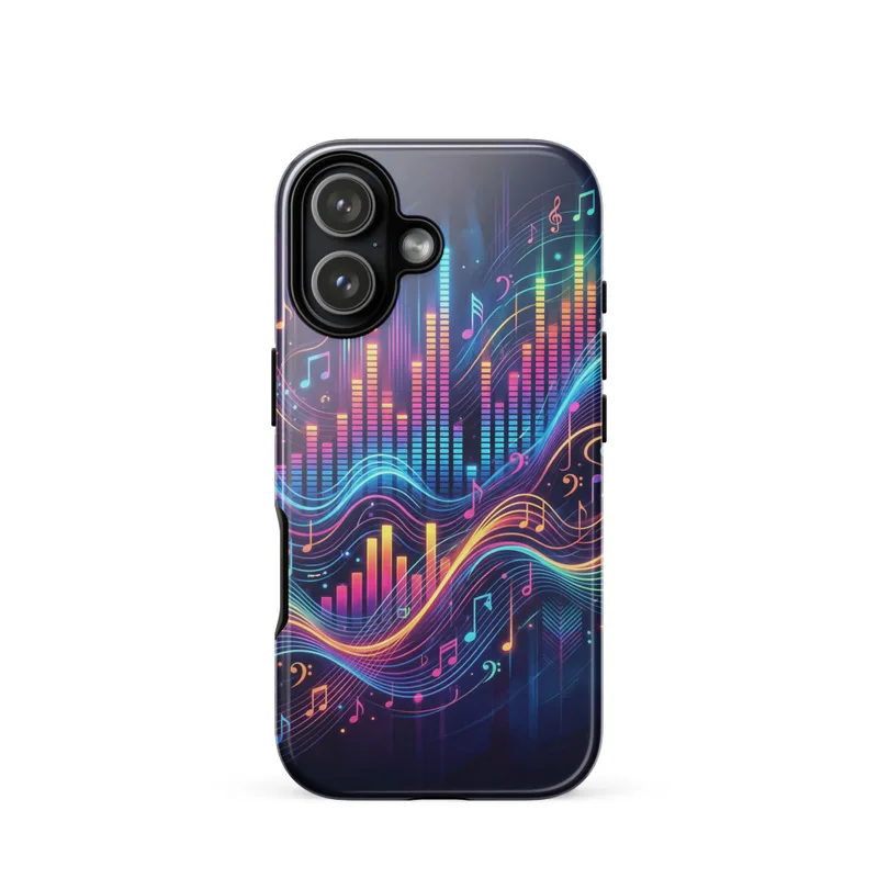
Equalizer Light Bars Tough Phone Case, iPhone 15, 16 and 17 case, abstract music art, vibrant gradient design, gift for music lovers
Glowing equalizer light bars, flowing sound waves, and music note shapes create a bold modern graphic across this tough phone case. Vibrant gradient colors bring an energetic rhythmic composition to the vinyl surface, turning your iPhone into a striking piece of abstract music art. A practical choice for music lovers or a gift for DJs and design fans.
In a dim listening corner, this piece suits the hour when a record is turning and the room is lit by a desk lamp, a strip of coloured LEDs, or the soft blue light from a screen. Place it near a turntable, compact speakers, or a shelf of records, where its changing bands of colour can sit against darker furnishings without disappearing. It also works in a home office, bedroom, studio, or hallway where music and graphic design already have a place. The rounded form of the phone case gives the composition a contained, portable scale, while the glossy vinyl surface catches small changes in the surrounding light. Display it on a narrow ledge, a stand beside your speakers, or among other objects in a music-themed arrangement. In daylight, the gradient reads as a clean field of saturated colour; under warmer evening light, the same tones take on a deeper, more atmospheric appearance. It is made for an iPhone 15, 16, or 17, but the visual focus remains on the abstract composition rather than on a literal scene.
Across the case, vertical equalizer bars rise and fall in uneven groups, creating a visual rhythm from one side to the other. Some bars are short and closely spaced; others extend higher, giving the layout the irregular pulse of a changing track. Flowing wave lines pass through and around them, bending in smooth arcs rather than following a straight grid. Small music-note forms interrupt the larger shapes, adding recognisable symbols without turning the image into a conventional illustration. The colour moves through vivid blue, violet, magenta, pink, orange, and yellow, with gradual transitions that make neighbouring bands appear to glow against one another. Darker areas give the brighter bars definition, while the overlapping lines add movement across the broad central field. The design is abstract enough to leave room for interpretation: it might suggest a club equalizer, a waveform on a screen, or sound spreading through a room. Set against the vinyl case, these elements form a compact graphic that remains legible at hand size and still offers plenty of detail when viewed from across a room.
For a calm setting, place it against a charcoal, ink-blue, or warm grey wall, where the blue and violet portions can sit naturally while the pink, orange, and yellow provide contrast. A white or pale beige wall will make the full gradient appear more open and graphic. If you frame or display it alongside other artwork, choose a slim black frame, a clear acrylic stand, or a simple natural-wood surround so the colour remains the main point of focus. It would sit comfortably beside a monochrome concert poster, a photograph of turntables or studio equipment, a geometric print, or a small artwork built from lines and repeated forms. Keep nearby objects restrained in colour—black speakers, brushed metal, dark shelving, or plain wood will help separate the saturated bars from the background. For a more layered arrangement, combine it with a record sleeve, headphones, and a small lamp, leaving enough space around the case for the waves and note shapes to read clearly.
“A rhythmic burst of equalizer bars and sound waves brings vibrant, music-driven energy to everyday carry.”
- SubjectGlowing equalizer bars, flowing sound waves, and music note shapes create an audio-inspired graphic.
- Palette & lightVibrant gradient colors suggest luminous, high-energy lighting across the abstract design.
- CompositionBold modern forms flow rhythmically in a full-bleed composition with strong visual movement.
- Where it fitsA lively choice for music lovers, festival kits, dorm rooms, or late-night studio sessions.
| Care | Wipe clean with a dry cloth; avoid abrasive cleaners on the printed face. |
| Shipping | Made to order — ships in 2–5 business days |