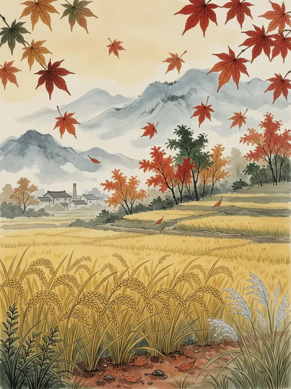
Start of Autumn Art Print, modern gouache ink painting, Chinese seasonal landscape, serene wall art, thoughtful gift
Start of Autumn 立秋 unfolds in a poetic Chinese seasonal landscape, with golden ripening rice and the first red maple leaves rendered in modern gouache guochao style blended with ink painting. This Art Print on Enhanced Matte Paper (189 g/m²) brings muted seasonal light to a wall, making it a thoughtful gift for lovers of Chinese art.
The eye meets a low, quiet landscape arranged in broad horizontal bands: a field of ripening rice occupies the foreground, its stalks gathered into warm gold and ochre shapes, while red maple leaves punctuate the upper space. The palette stays restrained, moving through straw yellow, faded olive, soft charcoal, and the first clear notes of autumn red. Gouache gives the colour areas a smooth, opaque presence, while ink brings a finer rhythm to the edges, stems, and scattered leaf forms. Some lines appear deliberate and assured; others thin out or soften, leaving open space around the details. This balance keeps the scene calm rather than crowded, with the eye travelling from the textured rice towards the sparse maple foliage and the pale distance beyond.
The image draws on the Twenty-Four Solar Terms, the traditional Chinese system of seasonal markers, through the moment of 立秋, or the beginning of autumn. Rather than showing a dramatic change of weather, it focuses on the subtle signs that arrive at the turn of the season: grain nearing harvest and maple leaves beginning to redden. Its visual language belongs to contemporary guochao, a modern Chinese design approach that brings recognisable cultural imagery into a simplified, current composition. One clear marker is the combination of flat gouache colour fields with expressive ink contours, recalling the structure of ink painting while allowing the golds, greens, and reds to sit in clean, graphic areas. The result feels connected to Chinese landscape painting without copying a literal scroll format, and the seasonal subject remains easy to read from across a room.
On a wall, the print brings the feeling of a quiet field at the edge of a seasonal change. It suits spaces with natural wood, pale plaster, linen, stone, or other subdued materials, and can sit comfortably among neutral furnishings without adding a hard contrast. The muted palette works especially well beside cream, warm grey, moss, tan, or deep brown, while the small red leaves offer a restrained accent. Place it where daylight can move across the surface—near a window, above a desk, in a reading corner, or along a hallway—so the soft yellows and ink lines remain visible without competing with strong patterns. In evening light, the darker contours give the landscape definition; in gentle morning or late-afternoon light, the rice and maple colours appear warmer. It makes a considered gift for someone drawn to Chinese art, seasonal symbolism, quiet landscapes, or the changing details of the countryside.
“A serene seasonal transition piece that bridges late-summer gold and the first whisper of autumn red.”
- SubjectGolden ripening rice fields with the first blush of red maple leaves.
- Palette & lightWarm ochre and amber tones layered with soft crimson accents under gentle daylight.
- CompositionHorizontal field view with low horizon, allowing sky and foliage room to breathe.
- Where it fitsLiving rooms, entryways, or housewarmings for those drawn to quiet seasonal themes.
| Material | Enhanced Matte Paper (189 g/m²) |
| Digital printing | |
| Care | Frame or mount out of direct sunlight; wipe gently with a dry, soft cloth. |
| Shipping | Made to order — ships in 2–5 business days |