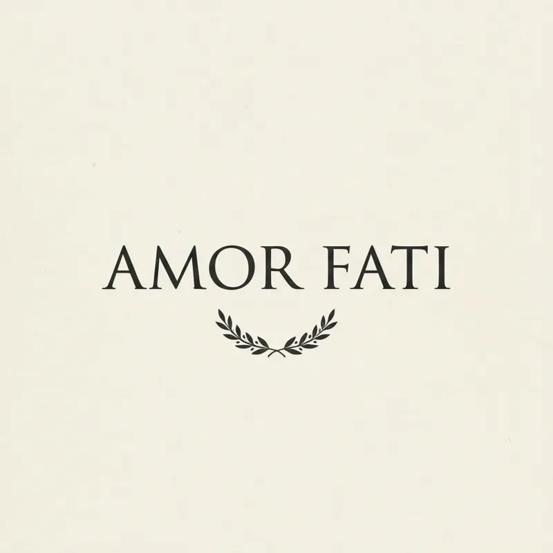
AMOR FATI Stoic Typography Art Print, minimalist serif wall art, study decor, reading nook artwork, Stoic gift
AMOR FATI, the Stoic maxim meaning “love of fate,” is set in elegant serif lettering at the center of a warm ivory square with a subtle laurel motif and generous negative space. Printed edge to edge on Enhanced Matte Paper (189 g/m²), this minimalist typography art print brings a calm, reflective presence to a study, reading nook, or thoughtful gift.
The eye meets a warm ivory square, held steady by a generous field of negative space. At its centre, “AMOR FATI” is arranged in elegant serif lettering, with measured proportions and fine, controlled lines that give the words a formal, bookish presence. The letterforms are the main visual structure rather than part of a larger scene, so the composition stays clear from across a room and quietly detailed at close range. Around the wording, a subtle laurel motif introduces a curved organic note without competing with the straight stems, brackets, and balanced spacing of the type. The palette remains restrained: warm ivory as the ground, with the lettering and laurel kept visually soft and composed rather than bright or busy. The edge-to-edge square field makes the print read as one complete panel, with no decorative border interrupting the open space. Its matte surface suits the calm character of the design, reducing visual distraction and keeping attention on the phrase, the rhythm of the serif forms, and the small arc of leaves.
The style belongs to a classical visual tradition interpreted through modern, pared-back typography. Its clearest concrete marker is the laurel motif, a familiar emblem from classical art that brings a sense of ceremony and endurance to the otherwise spare layout. The Latin phrase also supports that connection, while the serif lettering recalls the deliberate structure of engraved or inscribed text: vertical strokes, varied line widths, and carefully shaped terminals create a sense of order. This is not a crowded historical reproduction; it uses one classical symbol and formal type to make a contemporary wall composition. The words “amor fati,” meaning “love of fate,” give the image a reflective centre, while the surrounding space leaves room for the phrase to be read without visual pressure. It can sit naturally among books, wood furniture, stoneware, or other objects with simple silhouettes, especially where a room already leans toward quiet, considered materials. The print’s restrained language also makes it suitable for a study or reading nook that favours structure over ornament.
Hang it on a warm white, cream, sand, pale grey, or muted sage wall where the ivory ground can remain distinct without creating a sharp contrast. In a study, it can sit above a writing desk, beside a bookcase, or on a wall near a reading chair. In a reading nook, place it where the square shape has breathing room around it rather than wedged between many small frames. Soft daylight from a nearby window will reveal the difference between the warm ivory field and the surrounding wall, while indirect light keeps the serif lettering easy to read. It also works under a warm table lamp or wall light, particularly in the evening, when the subdued palette can settle into the room without casting a glossy reflection. Pair it with oak, walnut, black metal, linen, or natural woven textures for a grounded arrangement; keep neighbouring artwork simple if you want the central phrase and laurel to remain the focal point.
“A restrained Amor Fati poster that pairs classical typographic poise with the philosophical reassurance of accepting one's fate.”
- SubjectSerif 'Amor Fati' wordmark with a small laurel ornament above the lettering.
- Palette & lightIvory parchment ground, near-black ink, soft matte finish with even tonal light.
- CompositionStrictly centered vertical stack, generous margins, symmetrical balance, calm negative space.
- Where it fitsHome office wall, reading corner, or considered gift for a philosophy-minded friend.
| Style | Minimalist |
| Subject | AMOR FATI typography |
| Colors | white |
| Orientation | Square |
| Suited to | office |
| Material | Enhanced Matte Paper (189 g/m²) |
| Digital printing | |
| Care | Frame or mount out of direct sunlight; wipe gently with a dry, soft cloth. |
| Shipping | Made to order — ships in 2–5 business days |