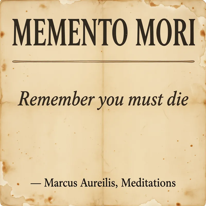
Memento Mori Typography Print, vintage philosophy art, study decor, Marcus Aurelius gift, contemplative wall art
The “Memento Mori” typography print presents Marcus Aurelius’s timeless wisdom in a restrained vintage composition, with aged textures and a contemplative historical feel. Printed on enhanced matte paper (189 g/m²), the art print brings crisp digital detail and a refined, low-glare finish to a private study, reading nook, or thoughtful philosophy-inspired gift.
In a quiet study, reading nook, or bedroom corner, this print suits the hour when the room begins to settle: a book left open on a wooden desk, a brass lamp casting a warm pool of light, and a chair set near the wall for unhurried reading. It can hang above a writing table, beside a narrow bookcase, or on the wall opposite a window where daylight moves gently across its restrained surface. The muted, timeworn character works naturally with walnut shelves, worn leather, linen curtains, and the soft shadows created by evening light. Rather than filling the room with bright colour or decorative noise, it gives a small space a point of focus—something to notice between pages, pauses, and ordinary routines. In a home office, it brings a philosophical note to the backdrop of a desk; in a reading nook, it sits comfortably among collected books and quiet objects; as a gift, it offers a considered presence for someone drawn to Stoic thought, classical writing, and reminders to stay attentive to the present.
The composition centres on the words “Memento Mori,” set as the clear visual subject in a restrained vintage typographic arrangement. The lettering is presented as a statement rather than part of an illustration-heavy scene, giving the phrase room to hold the eye. Its historical feel comes through in the balanced placement, aged surface texture, and subdued tonal treatment, which suggest an old philosophical broadside or a page preserved from a well-used study rather than a glossy modern poster. The design carries the name of Marcus Aurelius and the atmosphere of contemplative philosophy without crowding the wall with extra imagery. Fine digital detail keeps the letterforms defined, while the weathered appearance softens the overall effect and gives the print visual depth. Its palette is quiet and neutral, suited to rooms built around warm wood, charcoal, cream, stone, or faded olive. The rectangular format and simple typography make the artwork easy to read from across a room, while the surface remains calm enough to study at closer range.
For a traditional arrangement, place it in a slim walnut, dark oak, or black frame against an off-white, warm grey, sand, or muted sage wall. A natural wood frame brings out the print’s aged character and pairs well with bookshelves, leather seating, and desks made from oak or walnut; a black frame gives the lettering a sharper outline and works with iron shelving, charcoal textiles, and modern study furniture. Leave a little breathing room around it rather than surrounding the phrase with many small decorations. Beside it, try a framed botanical sketch, an antique-style map, a monochrome architectural print, or a simple still life in a related neutral palette. It also works above a stack of philosophy books, near a ceramic vase, or alongside a small brass clock, provided the neighbouring pieces remain quiet. In a gallery wall, use it as the textual anchor among two or three understated images, keeping frame finishes consistent so the words remain the first thing seen.
“A weathered typography print of Marcus Aurelius's Memento Mori lends quiet philosophical weight to contemplative corners.”
- SubjectMarcus Aurelius's Memento Mori rendered as weathered typography on aged paper
- Palette & lightMuted sepia and warm cream tones with soft, diffused antique lighting
- CompositionCentered text block with generous margins and balanced negative space
- Where it fitsA reading nook, study, or office of a reflective reader
| Style | Typography |
| Subject | Memento Mori quote |
| Colors | blush, beige, cream |
| Orientation | Square |
| Suited to | reading nook, office |
| Material | Enhanced Matte Paper (189 g/m²) |
| Digital printing | |
| Care | Frame or mount out of direct sunlight; wipe gently with a dry, soft cloth. |
| Shipping | Made to order — ships in 2–5 business days |