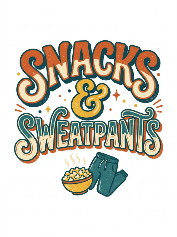
Snacks And Sweatpants Art Print, bold retro typography, cozy home decor in warm colors, funny gift for snack lovers
Bold retro typography spells out “Snacks And Sweatpants” in warm, friendly colors, paired with a small cute illustration for a playful lifestyle look. Printed as a crisp digital artwork on Enhanced Matte Paper (189 g/m²), this art print brings cozy humor to a gallery wall, desk, or kitchen and makes a fun gift for snack lovers.
The eye meets a compact field of large, rounded lettering arranged as the main visual block, with the words carrying the piece from edge to edge in an easy, readable rhythm. Warm clay red, golden yellow, soft orange, and cream give the composition the feel of a sunlit kitchen wall, while darker accents help the lettering hold its shape from across the room. The small accompanying illustration sits beside the type as a playful counterpoint, adding a simple character detail without competing with the message. Lines are clean and deliberate, with smooth curves, solid color areas, and the slightly softened geometry associated with cheerful vintage graphics. The result balances a strong typographic presence with a small moment of visual humor, making it readable at a glance but rewarding a closer look at the illustration and letter shapes.
Its visual language belongs to the mid-century and later retro graphic tradition, particularly the everyday advertising and sign-painting styles that turned short phrases into friendly focal points. One concrete marker is the use of rounded display lettering: forms are broad, closely spaced, and designed to feel approachable rather than formal or delicate. The limited palette also reflects that period-inspired approach, where a handful of warm colors could define an entire composition across a poster, diner sign, pantry label, or kitchen advertisement. Here, that language is redirected toward familiar homebody habits, pairing bold words with a small cute image instead of a product pitch. It fits naturally within a collection of relatable lifestyle humor, with enough graphic structure to sit alongside photographs, line drawings, or other text-led prints on a gallery wall. The tone is light without becoming noisy, making the message feel like part of the room rather than a temporary novelty.
Place it in a kitchen beside open shelving, framed recipes, wooden utensils, or a row of ceramic canisters, where the food-related humor has an immediate setting. It also works above a desk, near a reading chair, or in a relaxed living-room corner with a low bookcase and a soft throw. A natural oak, walnut, black, or cream frame can pull the colors in different directions: wood emphasizes the cozy domestic character, black gives the lettering sharper definition, and cream keeps the whole arrangement gentle. In daylight, especially near a window with warm morning or afternoon light, the clay, yellow, and orange tones read as inviting blocks of color. Under a warm lamp, the print can join a room with terracotta textiles, beige walls, red accents, or muted green plants. Hang it alone where the phrase can be read clearly, or group it with small food illustrations and casual typography for a relaxed, humorous arrangement.
“A playful celebration of cozy indulgence, this print pairs comfort food with relaxed attire for an unapologetically homey mood.”
- SubjectWhimsical illustration of comfort snacks and cozy loungewear celebrating simple pleasures
- Palette & lightWarm, inviting tones with soft matte finish and gentle contrast
- CompositionScattered casual arrangement with playful typography anchoring the relaxed theme
- Where it fitsDorm room, casual kitchen nook, or relaxed living space
| Style | Retro |
| Subject | Snacks and sweatpants |
| Colors | white |
| Orientation | Portrait |
| Suited to | dorm room, kitchen and dining room |
| Material | Enhanced Matte Paper (189 g/m²) |
| Digital printing | |
| Care | Frame or mount out of direct sunlight; wipe gently with a dry, soft cloth. |
| Shipping | Made to order — ships in 2–5 business days |