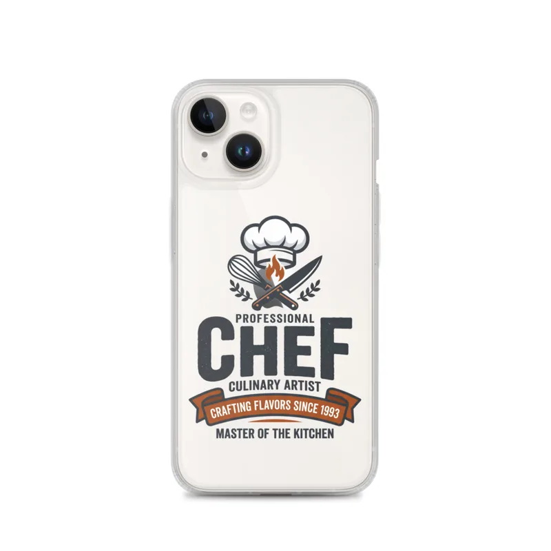
Head Chef Clear Phone Case, iPhone 14, 15, 16 and 17 case, bold typography, chef icon design, kitchen gift, chef pride
Bold “Head Chef” typography and a chef icon give this clear phone case a clean, modern look that puts occupation pride front and center. Designed for iPhone 14, 15, 16 and 17, the flat graphic artwork suits everyday use and makes a thoughtful gift for chefs, culinary students, restaurant teams, and anyone proud to work in the kitchen.
The eye meets the words “Head Chef” first, set in a bold, compact arrangement that gives the design a clear centre of gravity. The lettering carries most of the visual weight, while the chef icon provides a simple counterpoint and makes the kitchen role immediately recognisable. The artwork uses a flat graphic approach rather than shading or decorative detail, so its edges read cleanly against the transparent case. Because there is no illustrated background filling the surface, the colour of the phone beneath remains part of the composition, giving the design a light, open palette instead of a solid block of colour. The line quality is direct and controlled, with the icon reduced to the essential shape needed to suggest a chef. This balance between large type and a small emblem keeps the front visually organised. It suits a kitchen environment where labels, menus, notices and equipment often need to communicate their message quickly, while still giving the owner a personal way to show pride in their work.
The style belongs to the contemporary tradition of occupation-led graphic design: a modern visual language that turns a job title into the main subject of the image. Its concrete marker is the use of words as the dominant shape, with the chef icon acting almost like a sign or badge beside them. Rather than presenting a detailed portrait of a kitchen, the artwork identifies the person through their role. That approach connects with the straightforward visual culture of restaurant uniforms, kitchen doors, staff boards and service signage, where a short title needs to be understood at a glance. The flat icon and strong typography also place it comfortably within present-day digital and printed graphics, where a few carefully arranged elements can carry the entire message. On an iPhone 14, 15, 16 or 17, the design keeps that same emphasis: the title remains the main statement, while the transparent surface lets the phone’s own colour show around it. It can suit a working chef, a culinary student, a restaurant team member or someone who simply feels at home in the kitchen.
On a wall, the design wants the practical, bright atmosphere of a kitchen, dining area, studio workspace or hallway near the place where cooking happens. Its clear ground works best against a clean surface that does not compete with the lettering, such as a white, cream, pale grey or stainless-steel setting. In daylight, especially near a window, the surrounding light can keep the transparent areas open and allow the phone beneath to remain visible. Under warmer evening light, it can sit naturally beside wood, tile, brushed metal or painted cabinetry, linking the graphic to familiar kitchen materials without adding visual clutter. The composition is suited to direct illumination rather than dramatic spotlighting: the title and icon are meant to be read plainly, not hidden in shadow. As a piece associated with the Occupation Pride series, it offers a compact display of professional identity, whether kept with a chef’s everyday tools, placed among team belongings or given as a gift to someone who takes their kitchen role seriously.
“Bold chef typography and a clean icon turn everyday phone protection into a practical expression of kitchen pride.”
- Subject“Head Chef” lettering paired with a relevant chef icon celebrates culinary work.
- Palette & lightProfessional colors stand crisply against a plain white background.
- CompositionLarge, centered typography and iconography create a clean modern graphic.
- Where it fitsA thoughtful phone accessory for chefs, culinary students, and restaurant teams.
| Care | Wipe clean with a dry cloth; avoid abrasive cleaners on the printed face. |
| Shipping | Made to order — ships in 2–5 business days |