Soda Cup Fridge Magnet, cute dessert art, kitchen decor, gift for dessert lovers
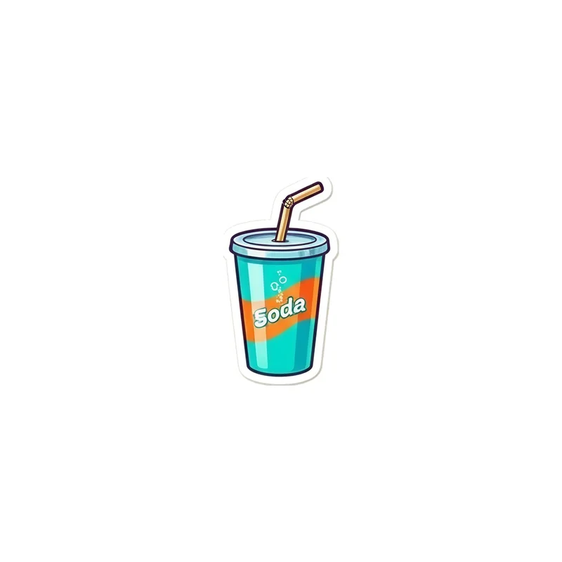
A teal takeaway cup with an orange stripe reading Soda, lid on and a paper straw. Die-cut and flexible, it sits flat on a fridge door or a locker.
The artwork is built around the compact shape of a fridge magnet rather than treated as a miniature poster. The takeaway cup has been reduced to its clearest silhouette: a rounded teal body, a fitted lid, a short paper straw, and one strong orange band across the front. Small peripheral features that might disappear at magnet size have been left out, while the cup itself is centred so the design reads immediately from a distance. The die-cut edge follows the cup’s outline, keeping the object recognisable when it sits on a fridge door or locker. That shape also gives the magnet a simple, sticker-like presence: it looks like a single illustrated drink placed among notes, photographs, menus, or other small everyday objects. The decision to use a cup instead of a flat rectangular label matters here, because the product feels like a tiny object in its own right, not just an image attached to the door.
The palette is limited but easy to spot. Teal fills the cup and gives the design its cool base, while the orange stripe creates a warm horizontal accent across the centre. The white paper straw and lid details break up the colour without making the image busy, and the word “Soda” remains the visual anchor on the front. The rounded cup, curved lid, straight straw, and clean stripe create a useful mix of soft and simple shapes. At this scale, the details that survive are the ones that define the drink: the takeaway form, the sealed lid, the straw rising above it, and the bold label. The flexible die-cut magnet keeps that outline intact when placed flat against a fridge door or locker, so the colour blocks and lettering stay easy to read. It works especially well beside stainless steel, white, black, or brightly coloured surfaces, where the teal and orange can stand apart without needing extra decoration.
People who recognise the Y2K Icons series will find the design familiar in its compact, graphic treatment of an everyday object. It uses the visual language of a cheerful takeaway drink—bright colour, a short label, and a deliberately simple silhouette—without turning the cup into a detailed illustration. Someone who associates soda cups with café stops, sweet treats, school lockers, or collecting small colourful accessories may choose it as a small marker of those habits. Dessert lovers can pair it with food-themed magnets, while anyone drawn to teal-and-orange colour combinations can use it as a bright accent on a fridge or locker. It is also a practical gift for someone whose personality shows up in small kitchen details: the person who keeps a favourite drink nearby, saves playful objects, or enjoys a touch of early-2000s-inspired colour in an otherwise ordinary space. Keeping it close means carrying that familiar soda-cup shape into the daily places where magnets are useful.
“A cheerful soda-cup magnet adds a small, graphic accent to kitchen spaces and makes an easy gift for dessert lovers.”
- SubjectSingle teal takeaway soda cup with an orange stripe, lid, and paper straw.
- Palette & lightTeal and orange create a fresh, playful color contrast.
- CompositionOne die-cut cartoon motif sits cleanly against a transparent background.
- Where it fitsA natural accent for fridge doors, kitchen corners, or a dessert lover’s space.
| Suited to | kitchen and dining room |
| Material | Made from 0.5 mm flexible vinyl |
| Digital printing | |
| Care | Wipe clean with a dry cloth; keep the printed face free of scratches. |
| Shipping | Made to order — ships in 2–5 business days |