Soda Cup MagSafe Clear Phone Case, iPhone 14, 15, 16 and 17 case, cute dessert art, kitchen decor, gift for dessert lovers
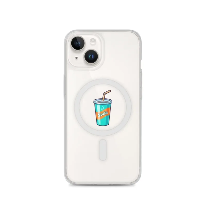
A teal takeaway cup with an orange stripe reading Soda, lid on and a paper straw. Printed on a MagSafe Clear Phone Case for iPhone 14, 15, 16 and 17.
The eye meets a compact, cheerful arrangement built around a turquoise-teal takeaway drink. A warm orange band cuts across the middle, carrying the simple word “Soda” in clear lettering, while the matching lid and slim paper straw give the cup a familiar corner-shop silhouette. The palette stays focused: cool teal for the main form, orange for the horizontal accent, and the clean transparency of the case around it. The shapes are rounded rather than geometric, with a straightforward illustrated line that keeps the cup readable at a glance. Nothing is crowded around the central motif, so the design has the visual ease of a small sign, sticker, or diner graphic. On an iPhone 14, 15, 16, or 17, the artwork leaves the phone’s own finish visible around the illustration, making the coloured cup feel placed on the surface rather than surrounded by a heavy background. The MagSafe clear case keeps that simple composition in view while adding a small, practical object to the image: a familiar drink rendered as a bright everyday icon.
The look belongs to the Y2K-inspired graphic language named by the series, drawing on the early-2000s fondness for compact logos, saturated colour blocks, and playful food-and-drink imagery. One concrete marker is the bold horizontal stripe: it recalls the way casual beverage branding used a single contrasting band to make a cup legible from across a counter or through a crowded refrigerator. The rounded lettering and limited palette keep the reference approachable rather than ornate, while the teal-and-orange pairing gives it a distinctly retro digital-era feel. It sits comfortably alongside kitchen signs, novelty labels, takeaway menus, and small objects designed to make an ordinary routine feel more personal. The cup does not need a detailed scene to suggest a place: it brings to mind a bright kitchen worktop, a neighbourhood soda counter, or a paper cup set beside a plate of something sweet. For dessert lovers, the connection is in that everyday pause before the first bite, when a cold drink and a treat share the same small moment.
The clear phone case works best where the phone is part of the room’s visual rhythm rather than hidden away: on a kitchen counter beside a fruit bowl, on a desk near a colourful mug, or on a bedside table catching the first light of the day. Against white tile, pale wood, stainless steel, or a soft cream wall, the teal cup remains distinct and the orange stripe gives the surrounding space a small point of warmth. In afternoon sun, the simple artwork reads like a tiny piece of counter signage; under warmer evening light, the orange band becomes more pronounced while the teal stays calm and cool. It can also sit naturally with Y2K references such as translucent accessories, chrome details, checkerboard textiles, or other small kitchen-themed objects. Because the design is compact and centred, it does not compete with a busy phone layout or a colourful room. It offers the feeling of a soda-shop illustration in hand, with enough clarity to be noticed when the phone rests face down and enough restraint to belong among the practical objects of an everyday kitchen.
“A playful soda-cup motif brings a crisp, colorful accent to everyday phone carry.”
- SubjectSingle teal takeaway soda cup with lid, paper straw, and orange Soda stripe.
- Palette & lightTeal and orange create a fresh, graphic contrast against the transparent background.
- CompositionOne die-cut cartoon motif keeps the design clean, centered, and easy to read.
- Where it fitsA cheerful phone accessory for soda fans, dessert lovers, or a playful dorm setup.
| Suited to | kitchen and dining room, dorm room |
| Care | Wipe clean with a dry cloth; avoid abrasive cleaners on the printed face. |
| Shipping | Made to order — ships in 2–5 business days |