Snack Attack In Blue Fridge Magnet, funny food meme, kitchen decor, gift for snack lovers
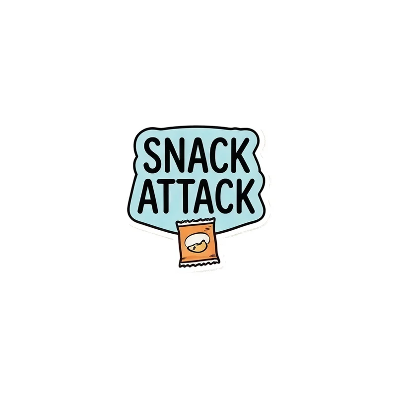
SNACK ATTACK in black type on a pale blue splat, with an open bag of chips hanging below. Die-cut and flexible, it sits flat on a fridge door or a locker.
The artwork is built around a familiar moment: the sudden, unreasonable need for something salty. To make that joke work as a small fridge magnet, the composition leaves out anything that would compete with the message. The lettering is kept large and centred, while the irregular splash behind it is reduced to a clear, pale-blue shape with a clean die-cut edge. The open snack packet is shifted beneath the words rather than spread across the whole design, so its crinkled top and hanging form remain easy to read without making the magnet too wide or visually crowded. Details that might disappear at this size—tiny ingredients, fine folds, or a complicated background—have been simplified. What remains is a compact vertical arrangement that sits neatly on a fridge door or locker, with the lower packet giving the flat text a little movement and a visual punchline.
The palette is limited but distinct: near-black type against a soft, washed blue burst, with the snack packet adding the warmer colours associated with crisps and savoury treats. The contrast keeps the phrase readable from a short distance, while the blue shape gives the black lettering a defined place to sit. Look closer and the design depends on simple graphic cues rather than fine illustration: the uneven outline of the splat, the open mouth of the bag, the loose folds at its top, and the way it drops below the text. The flexible, die-cut form follows that silhouette instead of forcing the image into a plain rectangle. On a white fridge, the blue reads cool and light; against a stainless-steel door or dark locker, the black type and snack-bag shape become the stronger visual elements. It has enough colour to stand out among notes, lists, and takeaway menus without turning the whole surface into a busy display.
Anyone who has stood in the kitchen insisting they are “only having one” snack will recognise the reference straight away. The phrase turns a minor craving into a mock emergency, and the open packet supplies the visual evidence: the attack has already begun. It suits someone whose fridge is a record of their habits, from late-night leftovers to packets kept for the commute, or someone who likes food jokes that are easy to understand at a glance. As a gift, it works for the friend who always asks what there is to eat, the flatmate who raids the cupboard, or the snack lover who treats crisps as a food group. Kept on a fridge, it marks the place where the craving is likely to be answered; moved to a locker, it carries the same small joke into a workplace, studio, classroom, or gym. The magnet is a compact way to make an ordinary surface admit what everyone already knows: the snack situation is serious.
“A playful snack-themed magnet adds a crisp blue accent and easy humor to fridges, lockers, and casual kitchen spaces.”
- SubjectBlack “SNACK ATTACK” lettering paired with an open bag of chips.
- Palette & lightPale blue splat, black type, and transparent negative space create a clean graphic look.
- CompositionOne flexible die-cut motif, with the chip bag hanging beneath the lettering.
- Where it fitsA natural fit for snack lovers’ fridges, college lockers, and casual kitchen corners.
| Suited to | kitchen and dining room, dorm room |
| Material | Made from 0.5 mm flexible vinyl |
| Digital printing | |
| Care | Wipe clean with a dry cloth; keep the printed face free of scratches. |
| Shipping | Made to order — ships in 2–5 business days |