Cool Cool MagSafe Clear Phone Case, iPhone 14, 15, 16 and 17 case, funny work meme, office decor, gift for coworkers
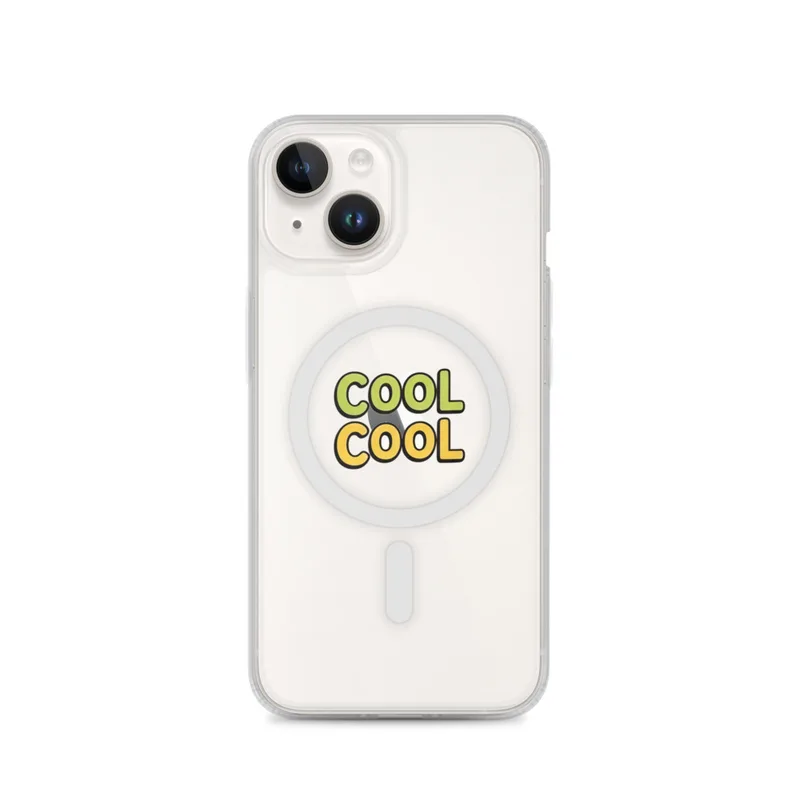
COOL COOL stacked twice in chunky lettering, the top line green and the bottom line yellow. Printed on a MagSafe Clear Phone Case for iPhone 14, 15, 16 and 17.
Held in the hand, this is a slim rectangular phone case with rounded corners, a smooth clear finish, and a rigid-looking shell shaped to fit the back and sides of an iPhone. The transparent material lets the phone’s own colour remain part of the appearance, while the printed design sits as a centred block on the rear panel with clear space around it. Its edges follow the phone rather than the lettering, so the case keeps the familiar outline of an iPhone 14, 15, 16 or 17. A MagSafe ring is built into the back, giving the case a practical detail beneath the graphic instead of turning the whole surface into a dense pattern. From the front and sides, the case stays visually quiet; from the back, the colour and text provide the main point of focus. It is an easy object to recognise in a shared office, at a desk, or in the middle of a meeting when it is placed beside a notebook, keyboard or coffee cup.
The artwork uses a short repeated word arranged in two stacked lines. The upper line is a fresh medium green, and the lower line is a clear sunny yellow, creating a simple two-colour contrast against the transparent case. Both lines use chunky lettering with broad strokes and compact spacing, so the message can be read quickly even at a glance. The repetition gives the design a deliberately dry, conversational tone: the same phrase appears once above the other, with the colour change doing as much work as the wording. Green carries the top half of the graphic, while yellow anchors the lower half, making the case feel brighter without adding illustrations, borders or extra decoration. The block shape suits a phone because it occupies the back as a compact visual panel, and the surrounding clear area prevents the lettering from feeling crowded against the curved corners. It works as a small reference to workplace language, especially for someone who enjoys understated jokes about meetings, emails, deadlines and polite agreement.
After months of everyday use, the case will continue to be read through the same basic arrangement: a clear phone outline, a green upper line, and a yellow lower line in bold lettering. Because the design is limited to two strong colours and one repeated phrase, it does not depend on fine details that could be difficult to notice once the phone is covered in fingerprints or placed under ordinary indoor light. The transparent surface may collect the small marks that come with being handled, set on desks and slipped into pockets, while the phone itself can develop the familiar signs of regular use around the edges. Those changes belong to the object’s daily life rather than the graphic’s simple structure. The case remains suited to someone who wants their phone to carry a readable office joke without a busy illustration or a large collection of references. It can sit comfortably beside work equipment, stand out among plain black cases, and serve as a casual gift for a coworker who appreciates a concise piece of workplace humour.
“A compact workplace joke in bright stacked lettering, suited to desks, commutes, and coworkers with a playful sense of humor.”
- Subject“COOL COOL” appears in chunky stacked lettering as a single die-cut cartoon motif.
- Palette & lightThe top lettering is green, the bottom lettering yellow, and the case remains transparent.
- CompositionOne centered motif keeps the phone case graphic clean and immediately readable.
- Where it fitsA cheerful desk accessory or low-risk gift for coworkers who appreciate workplace humor.
| Suited to | office |
| Care | Wipe clean with a dry cloth; avoid abrasive cleaners on the printed face. |
| Shipping | Made to order — ships in 2–5 business days |