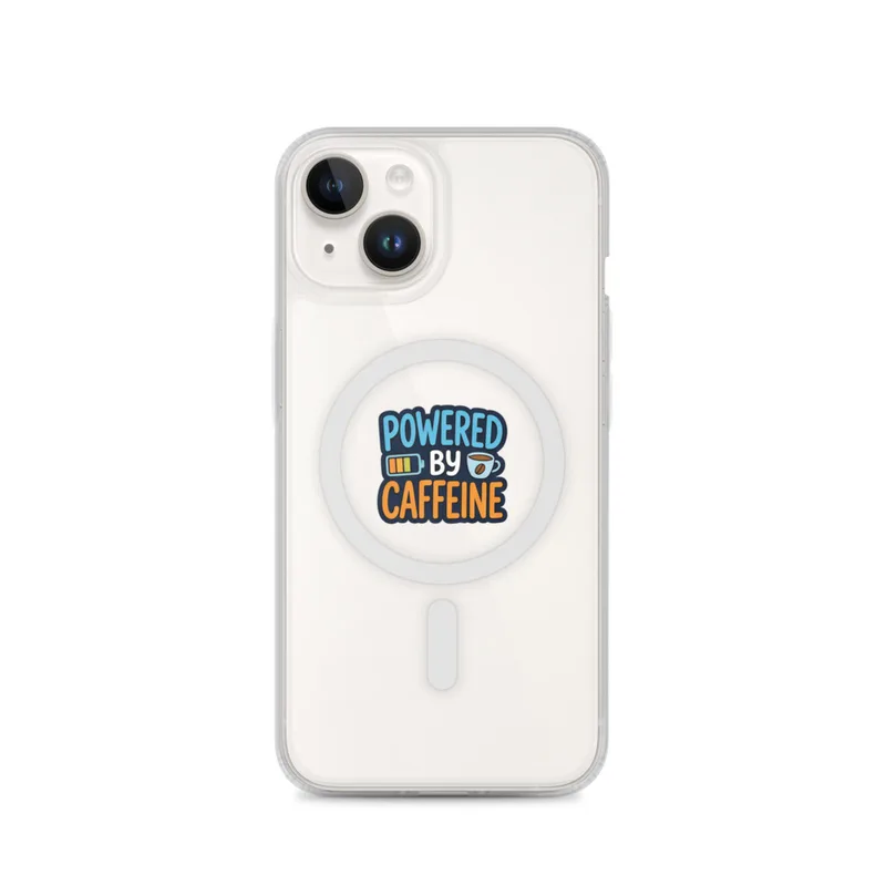
Powered By Caffeine MagSafe Clear Phone Case, iPhone 14, 15, 16 and 17 case, funny work meme, office decor, gift for coworkers
POWERED BY CAFFEINE on a navy splat, with a charging battery on one side and a coffee bean cup on the other. Printed on a MagSafe Clear Phone Case for iPhone 14, 15, 16 and 17.
The eye meets a compact, high-contrast arrangement built around a deep navy splat with irregular, ink-like edges. Across it, the phrase “POWERED BY CAFFEINE” is set in large white capitals, giving the design the direct, blocky rhythm of a sign or sticker. On one side, a simple battery symbol shows the language of a charging screen; on the other, a small cup marked by a coffee bean brings in a warmer, more familiar office reference. The palette stays focused: navy, white, black, and coffee brown, with the clear surface of the case letting the phone colour remain part of the composition. Clean outlines keep the symbols legible at a glance, while the uneven splat shape prevents the arrangement from feeling too formal. It is a small graphic with the visual order of a desk note, a break-room sign, and a phone notification brought together.
The style belongs to contemporary workplace meme graphics and digital pop design, where a short slogan is paired with a few instantly understood symbols. Its concrete marker is the use of bold all-caps lettering alongside simplified interface imagery: the battery icon comes from the visual language of screens, while the cup and bean point to the daily ritual behind the joke. The navy burst recalls printed stickers, notebook decals, and screen-printed patches, but the crisp type and compact icon set keep the piece connected to modern phone and computer culture. There is no detailed scene to decode and no elaborate background; the humour depends on quick recognition. That makes it suited to a home office, studio desk, shared workspace, or kitchen noticeboard, especially where coffee, deadlines, and charged devices are part of the everyday view. On an iPhone 14, 15, 16, or 17 MagSafe clear case, the artwork keeps its poster-like structure while the handset’s own colour shows around it.
For a wall, this piece wants a place near the practical centre of a room rather than a quiet gallery corner: above a coffee station, beside a desk, over a shelf of notebooks, or near a pinboard carrying calendars and reminders. It works particularly well against pale walls such as warm white, light grey, sand, or muted blue, where the navy shape has room to read clearly and the brown cup icon adds a modest note of warmth. In a darker office or bedroom, place it near a lamp with a neutral white bulb so the white lettering remains crisp without turning the navy into black. Daylight from a nearby window will bring out the contrast between the dark splat and the surrounding clear surface; softer afternoon light will make the coffee tones feel more settled. Grouped with black frames, cork, brushed metal, or natural wood, it can connect a practical workspace to the visual language of a coffee break. The result is an everyday reminder for desks, lockers, and shelves: keep the battery moving, keep the cup close.
“A witty caffeine-themed phone case for busy desks, morning routines, and coworkers who run on coffee.”
- Subject“Powered By Caffeine” pairs a charging battery with a coffee cup and bean.
- Palette & lightNavy lettering and splat contrast with the clear case background.
- CompositionOne die-cut cartoon motif keeps the design focused and readable.
- Where it fitsA practical coworker gift for office routines, commuting, or coffee breaks.
| Suited to | office |
| Care | Wipe clean with a dry cloth; avoid abrasive cleaners on the printed face. |
| Shipping | Made to order — ships in 2–5 business days |