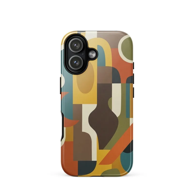
Organic Shapes Composition Tough Phone Case, mid-century modern art, minimalist iPhone 15, 16 and 17 case, retro gift
Organic and geometric shapes create a clean, flat composition in muted mustard yellow, teal, burnt orange and brown, bringing a mid-century modern feel to this tough phone case. Its case material complements the graphic design, while the iPhone 15, 16 and 17 case format makes a practical everyday choice or a gift for a modernist art lover.
This composition comes from the visual language of mid-century modern design, a period when artists, architects and graphic designers looked for clear forms that could work across posters, textiles, furniture and interiors. Rather than describing a landscape or a recognisable object, it builds its character from the relationship between circles, arcs, blocks and irregular organic forms. That blend of geometry and softness is associated with the clean-lined optimism of the mid-20th century, from European design studios to American homes and public spaces shaped by modernist ideas. The palette also belongs to that tradition: mustard yellow, teal, burnt orange and brown sit together with a softened, earthy quality instead of bright primary colour. The result has the feeling of a small piece of graphic design carried through from a print or an abstract wall study into an everyday object.
Here, the subject is not treated as a strict pattern or a symmetrical grid. Flat areas of colour meet in a balanced arrangement, allowing rounded shapes to sit beside sharper geometric sections without creating visual clutter. Mustard yellow gives the composition its warmest note, while teal adds a cooler counterpoint. Burnt orange brings a concentrated flash of colour, and brown anchors the arrangement with a grounded, almost wood-toned depth. The shapes remain distinct, with space between them so that each one can be read at a glance. On the tough phone case, this graphic treatment becomes something you handle throughout the day rather than something viewed only from across a room. The smooth case material supports the crisp, printed forms, and the iPhone 15, 16 and 17 format keeps the artwork in a familiar, practical scale. It is a compact way to bring a considered colour scheme and a little visual order to the objects you use every day.
This will appeal to someone who notices the difference between a random colourful pattern and a composition with structure. A mid-century modern collector may recognise the influence of postwar interiors, abstract posters and architectural graphics in the restrained shapes and earthy colours. Someone drawn to Scandinavian furniture, Palm Springs modernism or the clean geometry of a design studio may appreciate how easily the case sits within that wider vocabulary without copying a literal motif. It also suits the person who prefers accessories with a quiet point of view: enough colour to stand out on a desk or café table, but no lettering, slogan or busy illustration competing for attention. For a modernist art lover, it offers a useful object with the character of a small abstract work. As a gift, it makes sense for someone who carries an iPhone 15, 16 or 17 and likes their everyday belongings to reflect an interest in colour, form and design.
“Mid-century shapes and a restrained retro palette bring graphic character to an everyday phone accessory.”
- SubjectOrganic and geometric shapes arranged in a clean mid-century modern abstraction.
- Palette & lightMuted mustard yellow, teal, burnt orange, and brown create a warm retro palette.
- CompositionFlat, minimalist forms balance playful curves with structured geometry.
- Where it fitsA thoughtful gift for design-minded students, commuters, or lovers of modernist style.
| Suited to | dorm room |
| Care | Wipe clean with a dry cloth; avoid abrasive cleaners on the printed face. |
| Shipping | Made to order — ships in 2–5 business days |