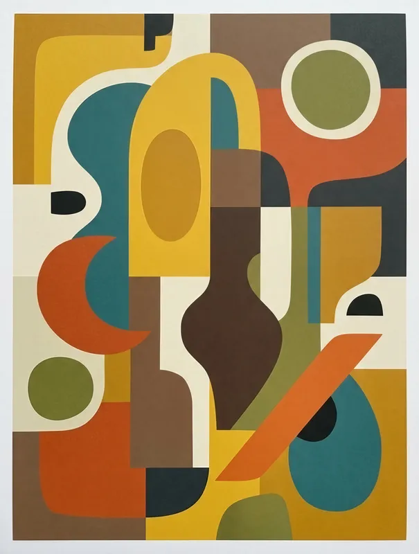
Organic Shapes Composition Art Print, mid-century modern abstract, minimalist home decor, gift for modern design lovers
Organic Shapes Composition brings together clean geometric and organic forms in mustard yellow, teal, burnt orange, and brown. This minimalist mid-century modern art print uses flat shapes and a muted retro palette on Enhanced Matte Paper (189 g/m²), making it a considered accent for a living room, office, or a thoughtful gift for modern design lovers.
The eye meets a balanced arrangement of mustard yellow, teal, burnt orange, and brown, set against open space rather than crowded into a detailed scene. Rounded forms sit beside blocks, bars, and other clean-edged shapes, creating a measured contrast between softness and structure. The line quality is spare and deliberate: there are no fine textures or drawn shadows to distract from the silhouettes, only flat colour fields and clear boundaries. Mustard brings warmth, teal adds a cooler note, and burnt orange connects the two with an earthy interval; brown grounds the composition and keeps the palette suited to natural wood, leather, cream, and charcoal furnishings. From across a room, the print reads as a quiet arrangement of colour. Closer in, its overlapping forms give the eye a simple route through the image, moving from one shape to the next without a fixed focal point.
This language belongs to the mid-century modern tradition, where decoration is reduced to useful geometry, organic contours, and a limited range of colours. One concrete marker is the meeting of rounded, biomorphic shapes with crisp geometric planes: a curved form can sit alongside a rectangle or narrow bar without either becoming illustrative. The result feels connected to the visual vocabulary of postwar interiors, but it remains easy to place in a contemporary home because the composition avoids ornate detail and strong visual clutter. It works particularly well with tapered furniture legs, low cabinets, woven upholstery, ceramic objects, and timber finishes. In a living room, it can sit above a sideboard or near a reading chair; in an office, it can bring colour to a wall beside a desk without competing with shelves or equipment. For someone drawn to restrained design, it also makes a thoughtful gift: personal enough to show an understanding of their taste, while flexible enough to suit different rooms.
The artwork wants a wall with breathing room around it, rather than a crowded gallery arrangement. Hang it above a walnut console, a pale oak cabinet, or a simple desk, leaving the surrounding wall visible so the shapes can retain their sense of balance. Daylight from a nearby window will reveal the difference between the cool teal and the warmer mustard and orange, while soft evening light will deepen the brown and make the palette feel more grounded. A north-facing room or a shaded corner can benefit from the warmer colours, especially beside white, sand, or light grey walls. Against a darker blue-green or clay-coloured wall, the print becomes more integrated and tonal; against white, it has a cleaner graphic presence. The matte finish helps keep the image visually calm under ordinary indoor light, making it suitable for a living room, home office, hallway, or a small reading nook.
“A muted mid-century palette and clean organic geometry give this print a calm, sophisticated presence that anchors modern interiors.”
- SubjectLayered organic and geometric shapes arranged in a balanced mid-century modern composition.
- Palette & lightMustard yellow, teal, burnt orange, and brown in muted retro tones on matte paper.
- CompositionFlat, full-bleed shapes with clean edges create a minimalist, balanced visual rhythm.
- Where it fitsLiving rooms, offices, or grouped gallery walls for design-minded collectors.
| Style | Mid-century modern |
| Subject | Organic and geometric shapes |
| Colors | mustard, olive |
| Orientation | Portrait |
| Suited to | living room, gallery wall |
| Material | Enhanced Matte Paper (189 g/m²) |
| Digital printing | |
| Care | Frame or mount out of direct sunlight; wipe gently with a dry, soft cloth. |
| Shipping | Made to order — ships in 2–5 business days |