Bauhaus geometric art print, minimalist modernist decor, colorful wall art for living rooms, gift for design lovers
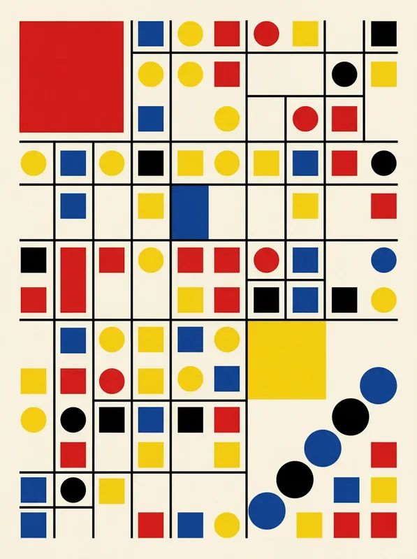
This Bauhaus geometric art print arranges small primary-color squares and circles with bold black lines in a minimalist modernist grid, set against a warm cream background and cropped by the image edges. Digital printing on Enhanced Matte Paper (189 g/m²) brings graphic color and structured 1920s-inspired style to a living room, office, or thoughtful design gift.
The eye meets a measured field of warm cream, interrupted by small squares and circles in primary red, yellow, and blue. Bold black lines give the composition its framework, crossing and enclosing the coloured shapes in an orderly grid without making the arrangement feel rigid. Some forms sit close to the edges and are cut by the frame, so the pattern appears to continue beyond the visible surface rather than ending in a complete border. The contrast between the dense black geometry and the open cream ground keeps the image clear from across the room, while the compact shapes reward a closer look. Hard-edged blocks, rounded circles, straight divisions, and generous empty space work together as a visual vocabulary: simple elements placed with enough variation to create rhythm. The palette stays focused, with no soft gradients or extra tones competing with the red, yellow, blue, black, and cream. It is a graphic composition for a wall that needs structure and colour without a busy scene or literal subject.
This language belongs to the Bauhaus modernist tradition of the 1920s, when artists and designers explored how basic forms, colour, and practical arrangement could communicate without ornament. One concrete marker is the use of elementary shapes—especially squares and circles—alongside primary colours and strong black divisions. Here, those ingredients are arranged as an abstract study rather than a picture of a place or object. The grid suggests order, but the cropped forms keep it from becoming a strict diagram; the eye can trace a line, pause at a circle, and move across the field to a contrasting square. That balance between geometry and movement makes the print suitable for interiors influenced by modernist design, mid-century furniture, Scandinavian simplicity, or contemporary rooms with clean silhouettes. It can sit comfortably among natural wood, black metal, white shelving, and coloured upholstery, adding a deliberate pattern while preserving the room’s open feel. For someone who enjoys design, architecture, or the visual logic of everyday objects, the piece offers a compact way to bring that tradition into a home, studio, or workspace.
On a living-room wall, it can anchor a narrow section above a low sideboard, a reading chair, or a small console, with the warm cream field helping it connect to plaster, linen, oak, or light-painted surfaces. In an office, it can add colour above a desk without introducing a landscape or text, while in a hallway it gives a short stretch of wall a clear focal point. The print is most at home where light can reveal the difference between the cream ground and the black lines: soft daylight from a nearby window keeps the palette calm, while brighter indirect light makes the primary colours more distinct. Avoid placing it where strong direct sun creates glare across the surface; a shaded wall, side-lit position, or diffused lamp allows the shapes to remain crisp. Against a deep green, navy, charcoal, or terracotta wall, the cream background creates a defined panel; against white or pale grey, it blends more quietly into the room. It also makes a considered gift for a design lover setting up a first flat, refreshing a home office, or building a collection of graphic wall pieces.
“Bauhaus-inspired primary shapes bring structured warmth and a confident graphic anchor to contemporary walls.”
- SubjectArrangement of squares and circles in a balanced floating grid.
- Palette & lightBold primary colors on soft matte paper, even and unreflective.
- CompositionStructured modular grid with rhythmic spacing and clean geometry.
- Where it fitsA modern living room, home office, or a first-art gift.
| Style | Geometric |
| Subject | Primary-color squares and circles |
| Colors | white, beige |
| Orientation | Portrait |
| Suited to | living room, office |
| Material | Enhanced Matte Paper (189 g/m²) |
| Digital printing | |
| Care | Frame or mount out of direct sunlight; wipe gently with a dry, soft cloth. |
| Shipping | Made to order — ships in 2–5 business days |