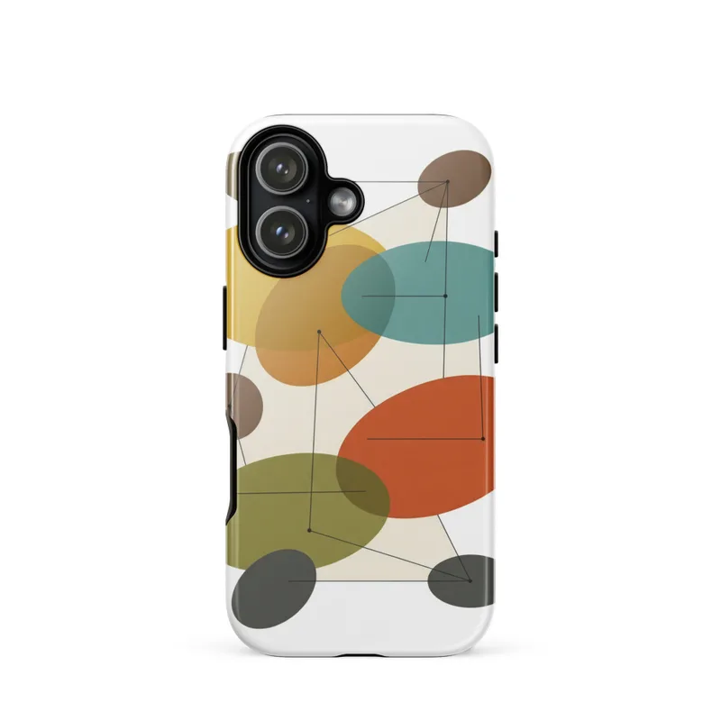
Balanced oval abstract Tough Phone Case, iPhone 15, 16 and 17 case, mid-century modern art, retro decor, modernist gift
Balanced ovals and thin connecting lines form a clean mid-century modern abstract on this tough phone case. Organic and geometric shapes in mustard yellow, teal, burnt orange, and brown create a muted 1950s–1960s look that stays minimalist and easy to carry. A thoughtful everyday gift for modernist art lovers.
Give this case to someone who notices the geometry in a tiled floor, a vintage poster, or a carefully arranged shelf. It suits a birthday, a housewarming, a graduation, or a small gift for a friend who prefers clean lines to busy patterns. It also works as a personal choice when you want a phone case that carries a little colour into an ordinary day without looking loud. Made for iPhone 15, 16, and 17, it brings the Mid-Century Abstract series into the hand rather than leaving it only on a wall or shelf. The design is suited to modernist art lovers, interior design fans, and anyone drawn to the balance between organic curves and measured structure. It can mark a new job, a move to a first home, or a simple thank-you for the person who always has a distinct point of view. Because it is an everyday object, the artwork stays close at hand: visible when the phone rests beside a coffee cup, sits on a desk, or is set down near the front door.
When you unwrap it, the first thing you see is a field of muted mustard yellow, teal, burnt orange, and brown. Rounded oval forms sit at different points across the surface, with slim lines running between them to create a quiet sense of connection. Some shapes feel soft and organic; others are held in place by the straight, deliberate paths of the lines. The arrangement has room to breathe, so the colours remain distinct rather than blending into one busy block. Mustard brings warmth, teal adds a cool counterpoint, and burnt orange gives the composition a small pulse of heat against the brown. The result recalls the restrained colour combinations of mid-century interiors while keeping the image simple enough for a phone. From a distance, it reads as a balanced pattern. In the hand, the smaller details become easier to notice: the spacing between the ovals, the changes in scale, and the way each line leads the eye toward another shape. The case turns a practical object into a compact piece of modernist design.
At home, it fits naturally with wood, brass, woven textiles, cream walls, and furniture with simple, tapered lines. Place the phone on a walnut desk and the brown and burnt orange settle into the room; set it beside a teal cushion or mustard vase and the smaller colour echoes become more apparent. It can sit comfortably in a quiet neutral interior, but it also gives a more colourful room a defined geometric note. Over time, the pattern remains easy to live with because it is neither tied to a single season nor dependent on a crowded decorative scheme. It works in a home office, on a bedside table, beside a record player, or near a stack of design books. The balanced ovals give it a friendly, human quality, while the connecting lines keep the overall impression orderly. Whether the phone is face down during dinner or resting on a console between errands, the case adds a considered detail to the spaces it passes through.
“A clean mid-century abstract brings balanced geometry and muted retro color to an everyday phone accessory.”
- SubjectBalanced ovals connected by slender lines, blending organic curves with geometric structure.
- Palette & lightMuted mustard yellow, teal, burnt orange, and brown create a restrained retro palette.
- CompositionClean flat shapes form a minimalist, evenly balanced arrangement inspired by 1950s and 1960s modernism.
- Where it fitsA distinctive everyday accessory for design-minded students, professionals, or mid-century modern enthusiasts.
| Suited to | dorm room, office |
| Care | Wipe clean with a dry cloth; avoid abrasive cleaners on the printed face. |
| Shipping | Made to order — ships in 2–5 business days |