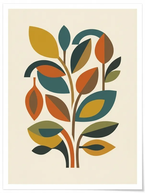
Abstract Leaf Cluster Art Print, mid-century modern decor, minimalist wall art, living room accent, gift for design lovers
An abstract mid-century leaf cluster brings organic and geometric shapes together in mustard yellow, teal, burnt orange and brown. Printed on Enhanced Matte Paper (189 g/m²), the clean flat artwork suits modern living rooms, offices and reading corners, making it a thoughtful gift for lovers of 1950s and 1960s design.
A compact cluster of stylised leaves fills the composition, balancing rounded organic forms with crisp geometric blocks. Mustard yellow, teal, burnt orange and brown sit against one another in a warm, grounded palette, with each colour held in a clean, flat area rather than blended or shaded. Curving leaf shapes overlap angular stems and simplified sections, creating a sense of rhythm without becoming busy. The line quality is spare and deliberate: edges are smooth, contours are easy to follow, and the arrangement leaves enough visual breathing room for the shapes to read clearly from across a room. Brown adds definition between the brighter mustard and orange areas, while teal brings a cooler note that keeps the palette from feeling overly warm. The result is an image with the visual clarity of cut paper or painted blocks, translated into a leafy arrangement that feels both natural and ordered. It can stand on its own above a small piece of furniture, or become one quiet element within a larger wall arrangement of graphic prints, ceramics and wood.
The style belongs to the mid-century modern visual language associated with the 1950s and 1960s, when interiors often brought simplified botanical motifs into conversation with strong geometric design. One concrete marker of that period is the use of flat, unmodulated colour: instead of realistic leaves with detailed veins, the subject is reduced to a few recognisable shapes and a carefully limited palette. That combination of abstraction and nature is useful in a room where furniture already has a clear silhouette, such as a walnut sideboard, a tapered-leg console or a low bookcase. The print can add a botanical reference without introducing the intricate detail of a traditional floral image. Its mustard, teal, burnt orange and brown tones also sit naturally alongside common mid-century materials and finishes, including warm wood, black metal, woven upholstery and smoked or clear glass. For a design lover, it offers a focused way to bring 1950s and 1960s-inspired colour and shape into an interior without making the room feel themed.
Give it a wall where the cluster can be seen without competing with a dense arrangement of objects. It works above a living-room console, beside a reading chair, over a compact office desk or on a narrow wall in a hallway leading into a more open space. A light neutral wall—warm white, pale cream, soft grey or muted sand—will let the darker brown and teal contours register clearly, while a deeper blue-green or clay-coloured wall can make the mustard and orange areas feel more pronounced. In daylight, place it where indirect light can reveal the contrast between the four flat colour fields without creating glare. Near a north-facing window, the warmer palette can help keep the setting visually inviting; in a brighter south- or west-facing room, position it away from the strongest direct rays so the composition remains easy to read. It also suits evening light from a floor lamp or wall sconce, particularly when the surrounding furnishings are kept simple. The clean shapes provide a calm accent for a living room, office or reading corner, with enough colour to connect nearby textiles, books and ceramics.
“Mid-century geometry meets botanical softness in a muted, versatile print that anchors a wall without competing for attention.”
- SubjectStylized leaf cluster rendered in clean geometric mid-century forms
- Palette & lightMuted retro tones with soft contrast on enhanced matte paper
- CompositionBalanced cluster arrangement with generous negative space for breathing room
- Where it fitsLiving room, reading nook, or gallery wall groupings for design-minded collectors
| Style | Abstract |
| Subject | Leaf cluster |
| Colors | cream, white |
| Orientation | Portrait |
| Suited to | living room, gallery wall |
| Material | Enhanced Matte Paper (189 g/m²) |
| Digital printing | |
| Care | Frame or mount out of direct sunlight; wipe gently with a dry, soft cloth. |
| Shipping | Made to order — ships in 2–5 business days |