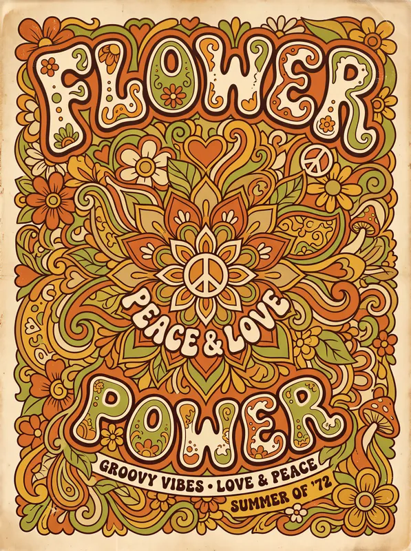
Flower Power Art Print, 1970s psychedelic wall art, warm earth tone decor, retro living room decor, gift for flower power fans
Bring 1970s flower power to your walls with rounded bubble lettering, psychedelic typography, peace symbols and floral motifs in burnt orange, avocado green and mustard yellow. Printed on Enhanced Matte Paper (189 g/m²), this vintage-inspired art print has a warm, funky look with a worn texture that suits retro living rooms, creative spaces or a peace-loving friend’s gift.
The eye meets a compact burst of rounded, bubble-shaped lettering, with each character swelling and curling into the next. Burnt orange sets the warm base, while avocado green and mustard yellow move through the words, flower forms and peace symbols like patches of colour in a hand-painted sign. The lines are soft rather than sharp, with uneven edges and a lightly weathered surface that keeps the design from feeling too polished. Petal shapes sit beside the typography, and the circular peace motifs give the composition a steady visual rhythm. It is bright without being neon, drawing on earthy shades that feel at home with walnut furniture, woven textiles and other warm-toned pieces. From across the room, the large lettering reads as a bold graphic shape; closer in, the small shifts in line and texture reveal the floral details and retro character.
This style belongs to the visual language of late-1960s and 1970s flower-power posters, where expressive lettering carried as much presence as an image. One clear marker is the peace symbol, repeated here as both a message and a graphic shape, alongside flowers that suggest the era’s connection with nature, community and counterculture. The inflated letterforms also point to the hand-drawn psychedelic typography used on concert notices, record sleeves and street posters, where letters bent, overlapped and filled the available space. Rather than following a strict modern grid, the composition lets the words, petals and circular emblems press against one another in a playful arrangement. Its burnt orange, avocado green and mustard yellow palette keeps the period reference grounded, avoiding the cooler colours and crisp digital finish associated with contemporary graphic design. The result suits someone who likes vintage-inspired decoration with a clear 1970s reference, whether that means a full retro scheme or one expressive piece among simpler furniture and plain walls.
Give it a wall where the colours can sit against a quiet background. It works above a low sofa in a living room with rust, cream, olive or tan upholstery, and it can bring warmth to a reading corner, studio, music room or home office. Against white or pale beige, the orange and yellow become the first points of attention; beside timber, cane, terracotta or dark green, the print settles into a deeper, more layered palette. Hang it where daylight reaches the surface from the side, so the rounded letters, flowers and worn-looking marks remain easy to see without the whole composition becoming visually flat. In a room lit by warm lamps, the earth tones take on a softer evening presence and sit naturally with brass, amber glass and patterned textiles. A simple wood frame keeps the 1970s connection clear, while a coloured frame in avocado green, mustard or burnt orange can make the display more deliberate. It is also a fitting gift for a friend who collects peace signs, enjoys psychedelic design or wants a small piece of flower-power atmosphere at home.
“Groovy 70s blooms and sunbursts deliver warm retro energy that softens modern walls and sparks conversation.”
- SubjectBold 70s typography woven through psychedelic flowers and radiating sunbursts
- Palette & lightWarm oranges, mustard yellow, teal, and magenta on soft matte paper
- CompositionCentered typographic focal point framed by layered botanical and radial motifs
- Where it fitsA boho-loving renter, dorm dweller, or anyone styling a relaxed living room
| Material | Enhanced Matte Paper (189 g/m²) |
| Digital printing | |
| Care | Frame or mount out of direct sunlight; wipe gently with a dry, soft cloth. |
| Shipping | Made to order — ships in 2–5 business days |