Mojito Recipe Art Print, vintage mid-century cocktail decor, kitchen wall art, gift for cocktail lovers, home bar decor
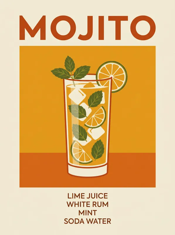
This vintage mid-century Mojito cocktail poster features a bold central drink illustration in its classic glass, topped with a fresh garnish, and a clean title above. Warm amber and burnt orange tones, minimal ingredient text, and generous negative space give the Art Print a crisp retro feel on Enhanced Matte Paper (189 g/m²), making it a stylish kitchen accent or cocktail lover’s gift.
The eye meets a tall central glass first, drawn with clean, confident lines and surrounded by generous open space. Its rounded shape gives the composition a steady vertical focus, while the garnish adds a small, lively detail at the top. Warm amber and burnt orange form the main colour field, balanced by lighter areas that keep the design clear rather than crowded. The title sits above the illustration in crisp lettering, with a short arrangement of ingredient text placed around it in a restrained, practical way. The line work is simple and graphic, with broad shapes, neat edges and little shading, so the image reads easily from across a room. The result has the directness of a printed kitchen chart: one drink, a few words, and a carefully measured amount of space around each element.
This style belongs to the mid-century modern tradition of illustrated food, travel and household graphics, where a limited palette and strong geometry made everyday subjects easy to recognise. A concrete marker is the use of flat colour blocks paired with straightforward sans-serif lettering, rather than ornate type or realistic painterly detail. The Mojito is treated as a composed arrangement of glass, garnish and text, almost like a page from a vintage recipe display or a drinks menu enlarged for the wall. That approach gives the artwork a period character without making it feel fussy. It suits the Cocktail Recipe Charts series especially well: the subject is functional as well as decorative, and the small amount of written information leaves the warm tones and central silhouette to do most of the visual work. It can sit comfortably beside other simple food illustrations, framed menu panels or old-style kitchen signs.
On a kitchen wall, the print works above a counter, beside open shelving or near a small drinks station, where its amber and orange tones can connect with timber, terracotta, brass or dark green tile. It also fits naturally in a home bar, dining nook or breakfast corner, especially against painted plaster in cream, pale grey, muted sage or warm white. Soft daylight will bring out the difference between the burnt orange areas and the lighter negative space, while a nearby wall light can make the graphic shapes feel warmer in the evening. Place it where the title and central glass can be seen without competing with busy shelves or patterned backsplashes. A simple black, walnut or natural wood frame will keep the mid-century character intact; a slim brass frame can pick up the drink’s warm palette. Alongside cocktail glasses, a wooden tray, ceramic bowls or a small vase of green herbs, it becomes part of a relaxed kitchen or bar arrangement without taking over the wall.
“A vintage cocktail recipe print that turns a kitchen wall into a relaxed, sun-soaked bar corner.”
- SubjectMojito recipe rendered in bold retro graphics with detailed mixology notes.
- Palette & lightSun-drenched vintage tones with a breezy, warm, nostalgic atmosphere.
- CompositionCentered typography and graphic elements balanced for clear at-a-glance reading.
- Where it fitsKitchen wall, home bar corner, or a gift for cocktail enthusiasts.
| Material | Enhanced Matte Paper (189 g/m²) |
| Digital printing | |
| Care | Frame or mount out of direct sunlight; wipe gently with a dry, soft cloth. |
| Shipping | Made to order — ships in 2–5 business days |