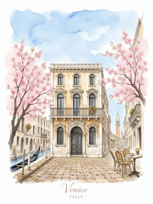
Venice Watercolor Sketch Art Print, travel wall art, cherry blossom decor, study decor, gift for Venice lovers
This art print presents a richly detailed Venice street-corner scene with fine pencil and ink architecture, loose watercolor washes, blooming cherry blossoms, cobblestones, and an iconic local landmark. Printed on Enhanced Matte Paper (189 g/m²), it pairs blush pink, pale blue, and sepia tones with cursive city lettering and country text. A thoughtful accent for study decor or a travel-inspired gift.
The eye meets a compact Venetian corner drawn in fine pencil and ink, where slender architectural lines set the structure before the colour begins to move. Sepia marks describe window frames, façades, ledges, and the uneven edges of old buildings, while pale blue washes open small areas of sky and give the scene a cool, airy balance. Blush-pink blossoms gather across the upper part of the composition, forming rounded clusters against the sharper geometry of the street. Below, loose strokes suggest cobblestones, with darker marks guiding the eye toward the familiar Venetian landmark placed within the view. The contrast between precise linework and softly bleeding colour keeps the scene detailed without making it feel rigid. Cursive lettering names Venice, with country text beneath it, adding the feeling of a page taken from a well-kept travel notebook. The palette stays gentle: cherry blossom pink, washed blue, warm sepia, and the natural lightness of the unpainted areas work together without strong black blocks or harsh saturation. It is a scene built from layered marks, small architectural details, and the sense of looking around a corner rather than facing a formal city panorama.
The style belongs to the pen-and-wash tradition of architectural travel sketching, where a quick but observant drawing records the character of a place through contour, proportion, and selected colour. Its concrete marker is the relationship between the ink outline and the diluted watercolor wash: the buildings and paving are first held in narrow, descriptive lines, then softened with translucent-looking areas of blue, pink, and sepia. That method leaves the hand of the sketch visible, including slight variations in line weight and the irregular edges of the colour. Rather than reducing Venice to a simple silhouette, the composition keeps the small signs of an inhabited street corner—masonry divisions, windows, paving, blossoms, and the landmark’s recognizable presence. The cursive city lettering continues that travel-journal language, functioning like a handwritten caption below a place study. This makes the artwork suitable for someone drawn to illustrated maps, European streets, and the quiet observation found in notebooks kept during a city walk. It can also sit comfortably with study decor because the fine lines invite close viewing, while the restrained palette remains calm around books, a desk, or framed photographs from travel.
On a light wall, the blush blossoms and pale blue areas will read clearly while the sepia architecture gives the artwork enough visual weight to hold its place above a desk, reading chair, narrow console, or bedside table. Natural daylight will bring out the contrast between the crisp pencil-and-ink details and the softer watercolor passages. Near a window, the pink branches can echo warm afternoon light; in a cooler room, the blue wash and brown linework will keep the scene balanced rather than overly sweet. Against white, cream, light gray, or muted blue walls, the palette will remain quiet and travel-focused. A warmer beige or clay-coloured wall will draw out the sepia marks and connect with wood furniture, woven baskets, leather-bound notebooks, or brass accents. The vertical lettering and clustered blossoms give the composition a clear upward direction, while the cobblestone area anchors the lower portion, making it easy to place above a study surface or within a gallery arrangement of city sketches. It offers a way to bring Venice into the room through line, colour, and a specific street-corner atmosphere.
“A soft watercolor study of Venice's canals brings quiet wanderlust to walls without overwhelming the room.”
- SubjectVenetian canals and sunlit architecture rendered in loose, fluid watercolor washes.
- Palette & lightSoft blues, warm ochres, and gentle pinks with airy, sun-washed luminosity throughout.
- CompositionLoose horizontal cityscape with iconic architecture balanced by open sky and water.
- Where it fitsBedrooms, reading corners, or any space craving a calm, travel-inspired mood.
| Style | Watercolor |
| Subject | Venice street corner |
| Colors | white, beige, cream |
| Orientation | Portrait |
| Suited to | living room, bedroom |
| Material | Enhanced Matte Paper (189 g/m²) |
| Digital printing | |
| Care | Frame or mount out of direct sunlight; wipe gently with a dry, soft cloth. |
| Shipping | Made to order — ships in 2–5 business days |