Tokyo Skyline Art Print, retro travel poster, modern city decor, home office wall art, gift for travelers and explorers
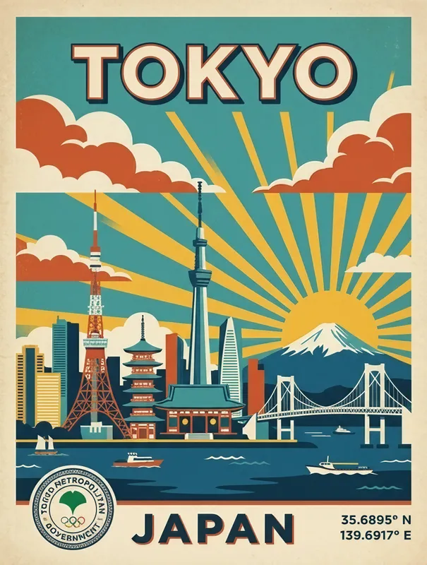
This retro Tokyo travel poster features a bold flat skyline with iconic landmarks, sunburst rays, a city seal, GPS coordinates, and vintage typography in a limited teal and burnt orange palette. Printed digitally on Enhanced Matte Paper (189 g/m²), the art print brings graphic city style to a home office or makes a thoughtful gift for travelers.
Tokyo’s skyline comes from a city where older cultural forms and modern architecture share the same horizon. In Japan’s capital, temples, narrow streets, towers, rail lines, offices, and dense residential districts sit within one large urban landscape. That combination gives Tokyo a distinctive visual character: familiar silhouettes appear beside geometric blocks, bright signs, and open areas shaped by the city’s changing scale. A skyline poster reduces that complexity into a set of recognisable forms, much like a travel souvenir turns a journey into one carefully chosen image. The subject is therefore both architectural and cultural. It represents Tokyo as a place to visit, navigate, remember, and imagine, rather than as a collection of buildings viewed from one exact street. The retro poster format adds another layer, connecting the city to the tradition of illustrated travel graphics, where colour, lettering, symbols, and composition work together to suggest a destination before any detailed map or photograph is needed.
This artwork treats Tokyo as a flat, graphic composition rather than a realistic city view. The skyline is arranged in strong, simplified shapes, with landmark forms standing against a field of teal and burnt orange. Teal gives the image a cool urban foundation, while burnt orange brings the warmth of a low sun, printed ink, or a late-afternoon glow. Behind the buildings, radiating sunburst lines create a clear sense of direction and movement, drawing the eye outward from the city. Vintage typography identifies the destination with the compact authority of an old rail or tourism poster, while a city seal adds the feeling of an official emblem. GPS coordinates provide a precise geographic note within the otherwise stylised design, grounding the broad idea of Tokyo in a particular place. The limited palette keeps the composition orderly and easy to read across a room, and the matte printed surface suits the poster’s restrained, archival appearance. Together, the skyline, rays, seal, coordinates, and lettering create a souvenir-like image without relying on photographic detail.
People who have travelled to Tokyo may recognise the feeling of seeing the city reduced to its key visual signals: a high-rise horizon, graphic signs, official symbols, and the sense of movement between neighbourhoods. Someone planning a first visit can use it as a visual marker for the destination they are looking forward to, while a regular traveller may see it as a reminder of train platforms, busy crossings, compact cafés, and long streets filled with changing architecture. It also suits anyone drawn to Japanese design, retro travel graphics, urban geometry, or colour-blocked interiors. In a home office, the poster can bring a defined teal-and-orange accent to a wall without competing with books, screens, or furniture. In an entryway, bedroom, or living space, it works as a conversation piece tied to a real city and a real set of coordinates. As a gift, it gives travellers and explorers a way to keep Tokyo present after a trip, or to mark a place still on their list.
“A twilight cityscape that balances architectural drama with quiet atmosphere, giving any wall a sense of place.”
- SubjectTokyo's skyline rendered as a luminous silhouette of towers and city lights.
- Palette & lightDeep twilight blues and indigos warmed by glowing windows and street-level shimmer.
- CompositionHorizontal skyline band anchors the lower half, leaving generous negative sky above.
- Where it fitsLiving room or home office for travelers, design-minded renters, and cityscape collectors.
| Style | Retro |
| Subject | Tokyo skyline |
| Colors | teal, gray, cream |
| Orientation | Portrait |
| Suited to | living room, office |
| Material | Enhanced Matte Paper (189 g/m²) |
| Digital printing | |
| Care | Frame or mount out of direct sunlight; wipe gently with a dry, soft cloth. |
| Shipping | Made to order — ships in 2–5 business days |